Inspirnex
Inspirnex is my studio, begun in India in 2013. It designs and builds software for organisations and makes products of its own: MidRate for iPhone, PaperPress for the Mac, Miqat for the mosque wall and Tallira for the shop counter. The brand, the site and the products are all mine.
- Venture
- Inspirnex
- Years
- 2013 to present
- Sector
- Design and software studio
- Scope
- Brand identity, Product design, Web design and development, Software products
- Website
- inspirnex.com
The idea
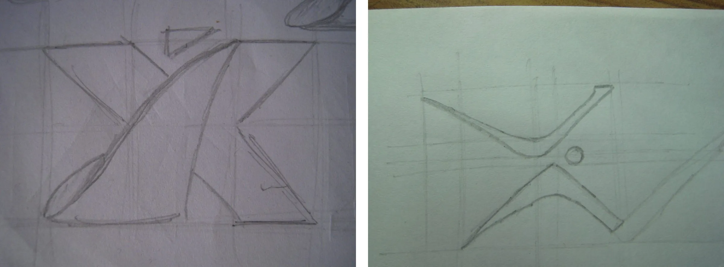
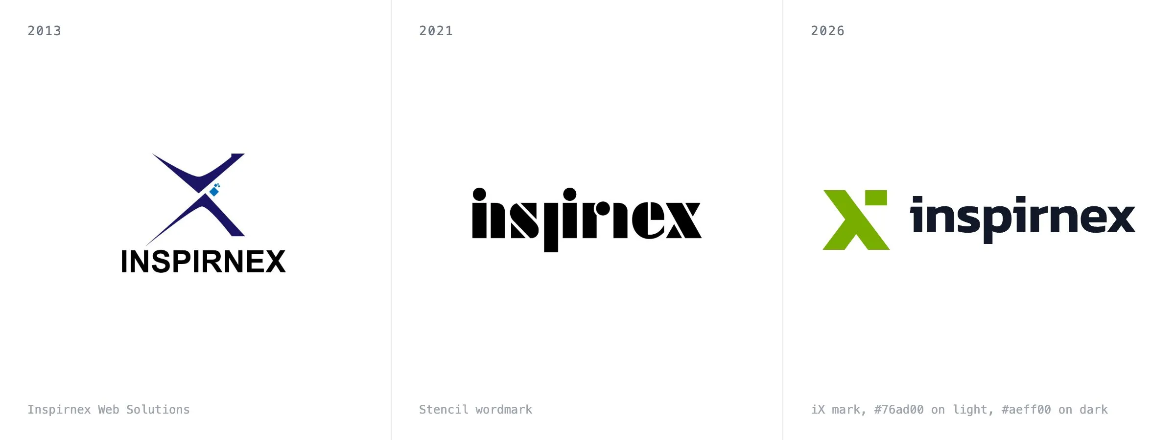
Inspirnex began in India in 2013 with a name, a mark and the intent to build for the web. The mark came first, in pencil on grid paper in December 2012: an X with a small shape floating off its top right corner, and a pen version that reads “Inspire Nex” under a cloud. By January 2013 it was a vector logo, a dark blue X with a trail of pixels and the words “Web Solutions” beneath.
The studio stands on one belief. Most brand people can’t build it. Most builders can’t make it good. A brand gets designed in one room and built in another, and the gap between the rooms is where good work dies: the typeface that never loaded, the spacing nobody kept, the product that looks nothing like the deck it was sold with. Inspirnex is one room. Brand, product and software sit under the same roof so that the person who makes the brand call is the one who ships it.
The studio does two kinds of work: custom software for organisations, the system under a business, with a clear scope and a result you can point at; and products of its own, which is where its opinions show.
Brand
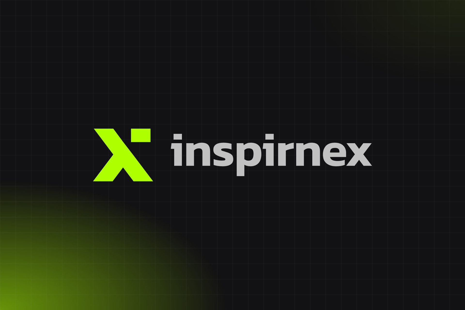
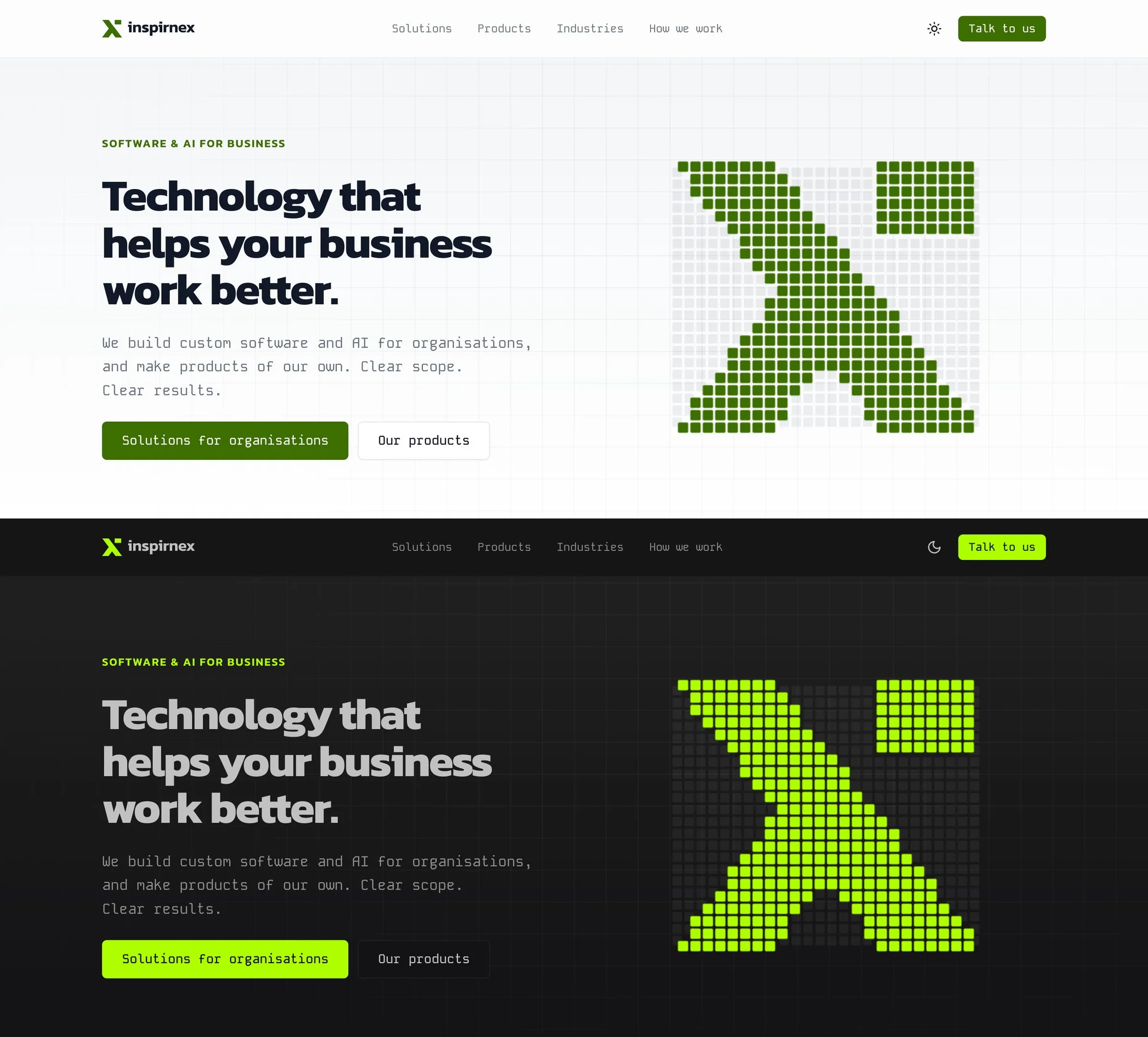
The mark is an X with its top right arm cut away and a detached square in its place. Read it as an X, or as an i whose dot has drifted up and to the right: iX. The detached shape is the one idea the brand has held since the first sketch in December 2012. It was a triangle on grid paper, a trail of pixels in the 2013 logo, a dot over the 2021 wordmark, and it is a square in the mark today. Everything else in the identity is built around that one fixed point.
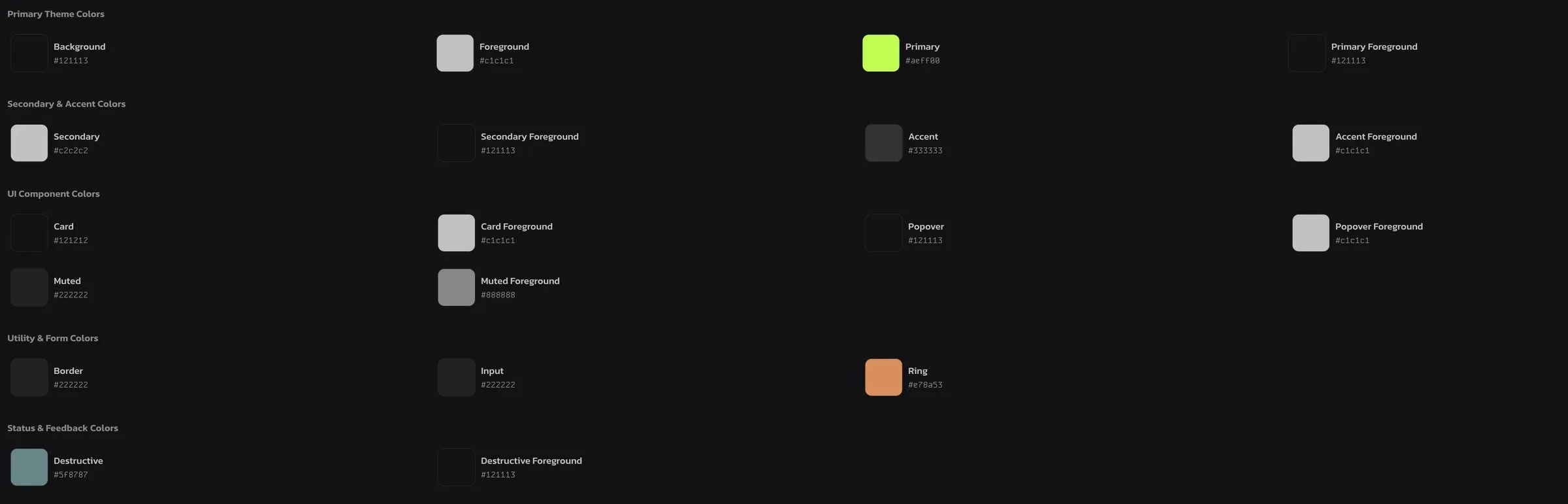
The colour is a lime, #aeff00, and it belongs to dark mode, where it sits on a near-black ground with soft grey text. On white the lime fails contrast, so light mode uses a deep green for buttons, labels and the mark. One brand, two greens, each chosen for the surface it sits on. The product cards carry their own accents, emerald, blue, purple and amber, the same in both themes.
Type is Kanit for headings, set tight, and Kode Mono for everything else, including body copy, so the whole site reads in monospace. It is a studio that writes software, and the type says so without a line of code on the page.
The headline is plain: “Technology that helps your business work better.” The line beneath it names the two kinds of work and makes two promises, clear scope and clear results. Nothing on the page claims more than that, because a client should be able to hold us to every word.
The hero graphic is the mark drawn on a grid of small tiles. The tiles that belong to the mark fly in from random positions and settle; the rest stay as a faint grid. It holds for most of its cycle, sits still on phones, and shows the finished mark to anyone who prefers reduced motion.
Products
Each product is a decision about what software should refuse to do.
PaperPress is a PDF utility for the Mac: combine, fill, sign and scan, compress and protect, with nothing leaving the machine. The documents people run through a PDF tool are the ones they least want uploaded, so there is no cloud, no account and no telemetry.
MidRate is a currency converter for iPhone built on the mid-market rate: 166 currencies with no margin added, and every rate stamped with when it was published. It has a case study of its own.
Miqat is a free prayer times display for the screen on a mosque wall. It runs in a Smart TV’s own browser with nothing to install, in 16 languages and with 12 calculation methods, and it is live at mymiqat.com. Its case study covers the design.
Tallira is the studio’s point of sale for retailers and restaurants in Saudi Arabia and the UAE, where every sale is a tax invoice. Its case study has the detail.
Principles
- One room. The person who makes the brand call is the one who ships it.
- Keep the one true thing fixed and build everything else around it.
- Choose each colour for the surface it sits on.
- A product is defined by what it refuses to do.
- Say only what a client can hold us to.