MidRate
MidRate is an iPhone currency converter from Inspirnex. It converts 166 currencies at the mid-market rate with no margin added, and every rate, in the app and in its widgets, says when it was published. No ads, no accounts.
- Venture
- MidRate
- Years
- 2026 to present
- Sector
- Personal finance
- Scope
- Product design, Brand identity, iOS development
- Website
- midrate.app
The idea
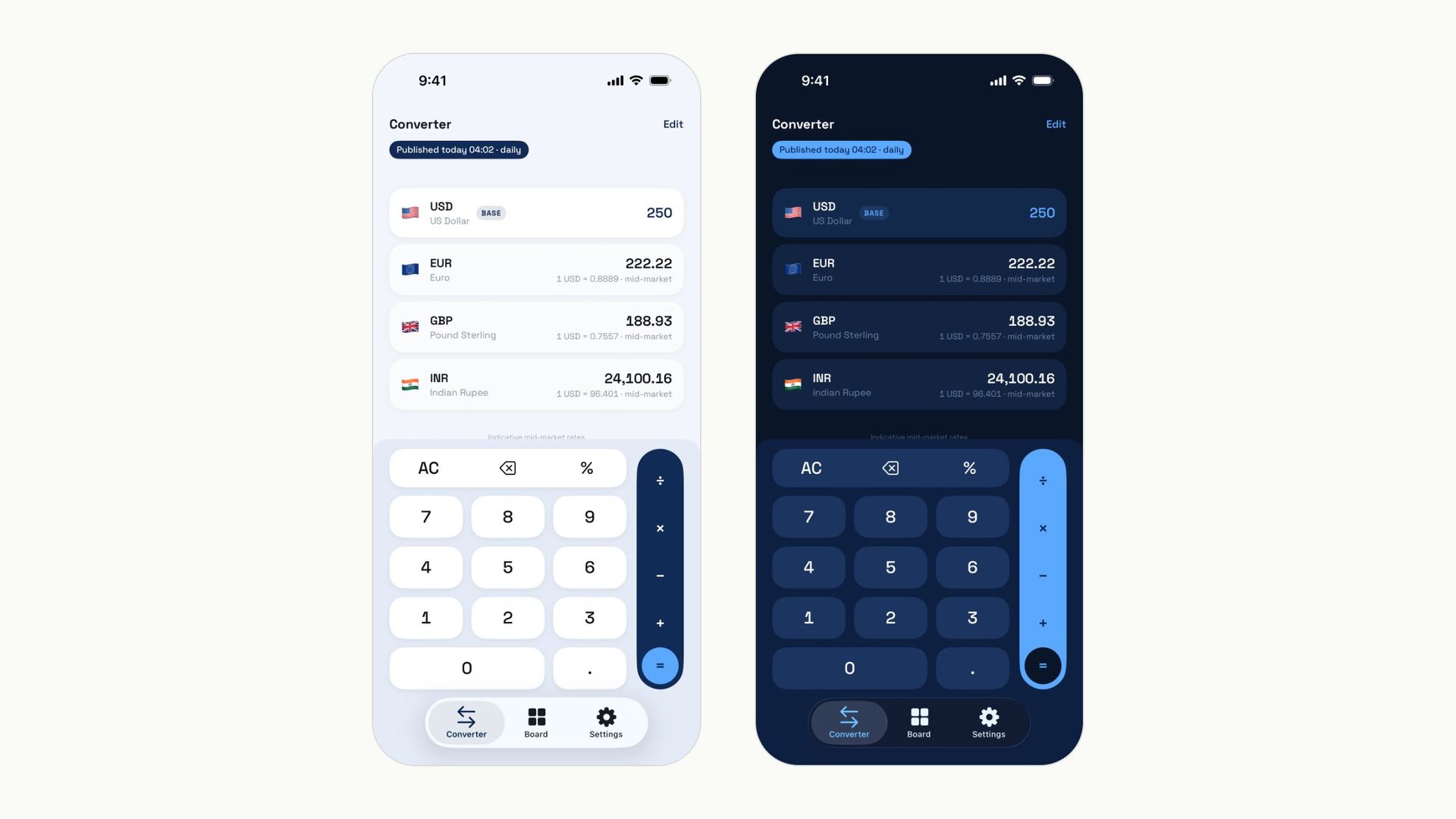
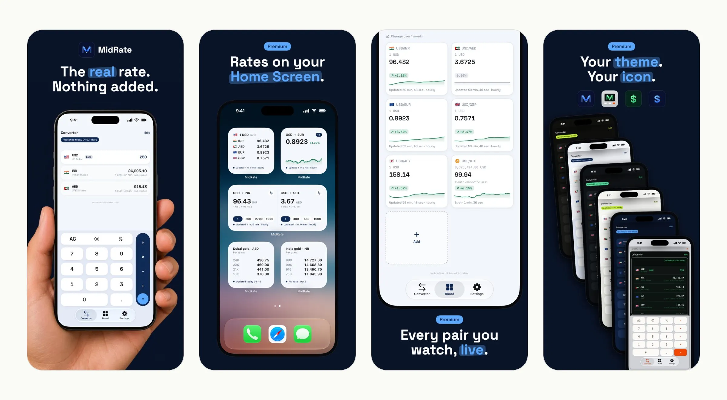
A currency converter has one job: show the real rate and say how fresh it is. Most fail it. The rate carries a hidden margin, the conversion sits under an ad, and the Home Screen widget shows a number that could be three days old without saying so. MidRate shows the mid-market rate, the midpoint between what banks buy and sell at, with no margin added, and prints the time it was published beside it. The name is the idea. The mid-market rate is the honest rate, and the app’s one promise sits on its first screen: “The real rate. Nothing added.”
I designed MidRate under Inspirnex for people who live between currencies and need to know what a number is worth today. One rule decides every hard case: a number the app did not fetch must never pass for one that it did.
Brand
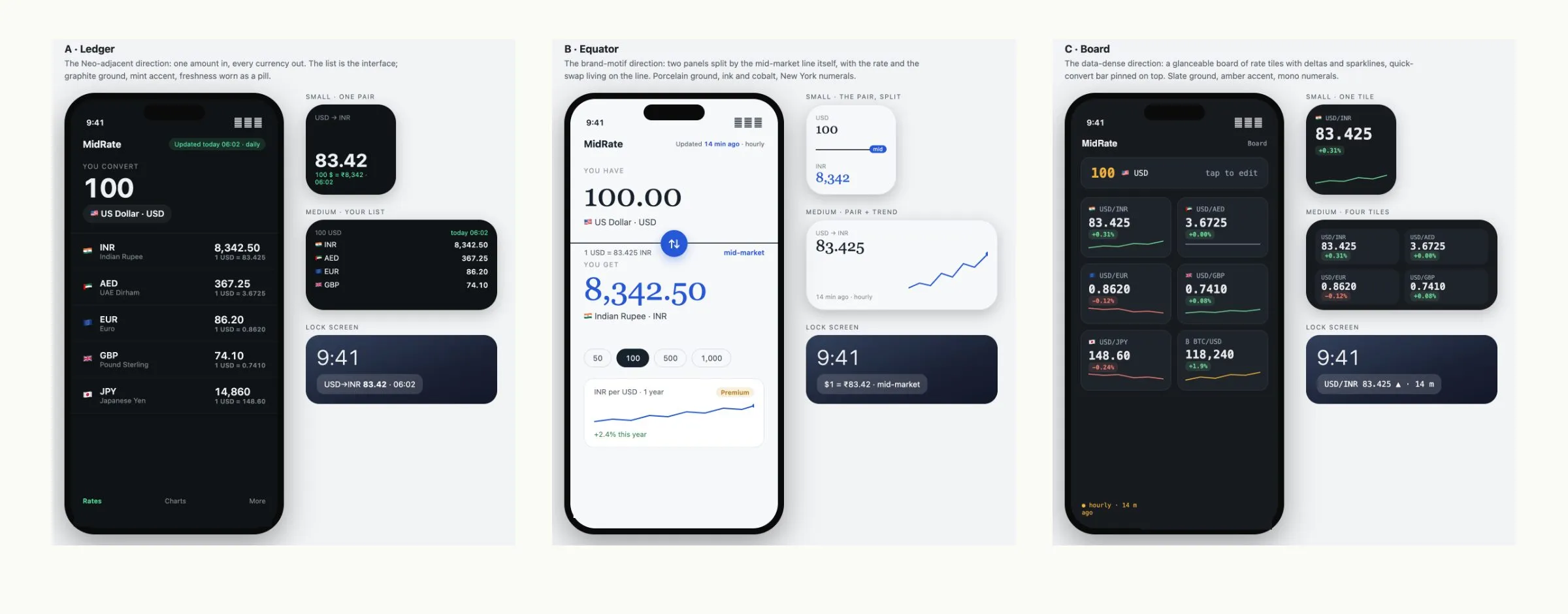
Three directions were drawn before the first screen was built. Ledger: one amount in, every currency out, a graphite list. Equator: two panels split by the mid-market line. Board: a grid of rate tiles with sparklines. The product takes something from each. The Converter is Ledger’s list, the Board is Board’s tiles, and Equator’s caption, “mid-market” beside every rate, is the one line of brand copy inside the app.
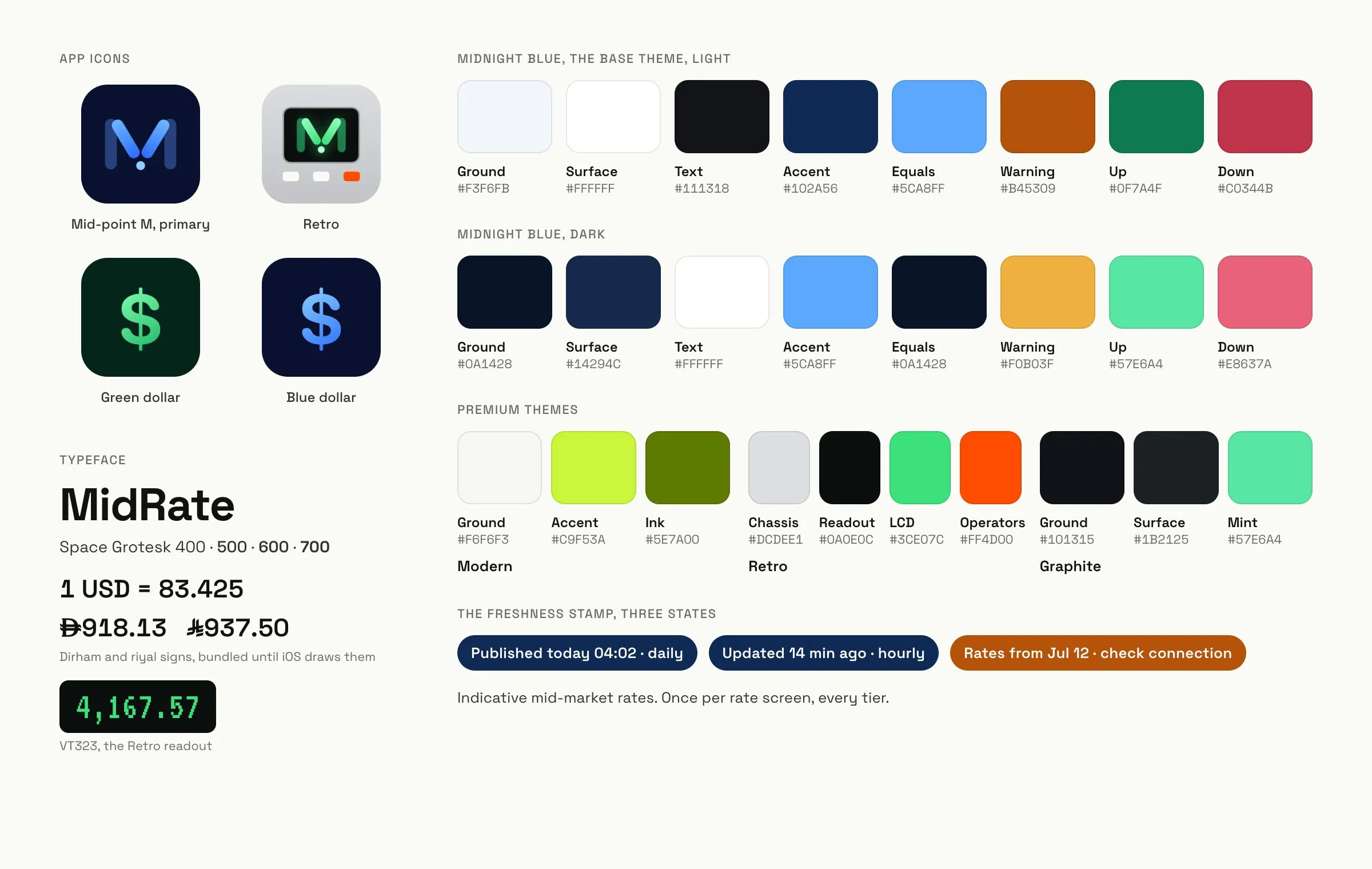
The default theme is Midnight Blue: deep navy on a pale blue-grey page in light, a pale blue accent on near-black in dark. Light and dark are drawn by hand rather than derived from each other, because the accent roles swap: light puts the operator rail in navy with a pale equals key, dark does the reverse. Three more themes sit beside it. Modern is a lime rail over warm greys. Retro is a silver calculator with a glowing green readout, orange operators and VT323 numerals. Graphite is the Ledger palette, near-black with a mint accent.
The typeface is Space Grotesk in four weights, with tabular figures so columns of amounts line up. The dirham and riyal signs, which iOS does not draw, ship in a small font of their own, built from the central banks’ artwork and fitted to Space Grotesk’s cap height. An app for people who live between those two currencies owes them real glyphs, not letters standing in.
The icon is a mid-point M: two pillars converge to a valley and a dot marks the mid-rate. Four icons ship, the Midnight Blue M, a Retro M, and a green and a blue dollar sign.
The most used piece of the system is the freshness stamp, a pill above every rate surface and inside every widget. “Published today 04:02 · daily” for the daily feed, where the time is the source’s, not the app’s. “Updated 14 min ago · hourly” for live rates. After 48 hours without a fresh table it turns amber and names the day the numbers are from. Three states, and the colour alone tells you whether to trust the screen.
Product
The Converter is a calculator and a list in one. You type into any row and every other row answers. The Board holds saved conversions as live tiles, “100 USD = 367.25 AED”, each with its own stamp and sparkline. Charts open from any rate row and run from one week to ten years. Three tabs: Converter, Board and Settings. The catalogue holds 166 currencies, four metals and 50 coins, so gold and bitcoin sit in the same list as the dirham.
The rule shapes details most people will never notice. The chart page prints no rate, because the rate of the moment and the history behind it are two different things, and only one of them should speak there. A pair fixed by law, such as the dirham to the dollar, draws no line and says who fixed it and since when. A withdrawn currency charts solid to the day it was withdrawn and dashed after. A rate the app could not fetch is shown as absent, never as a frozen number wearing a fresh stamp.
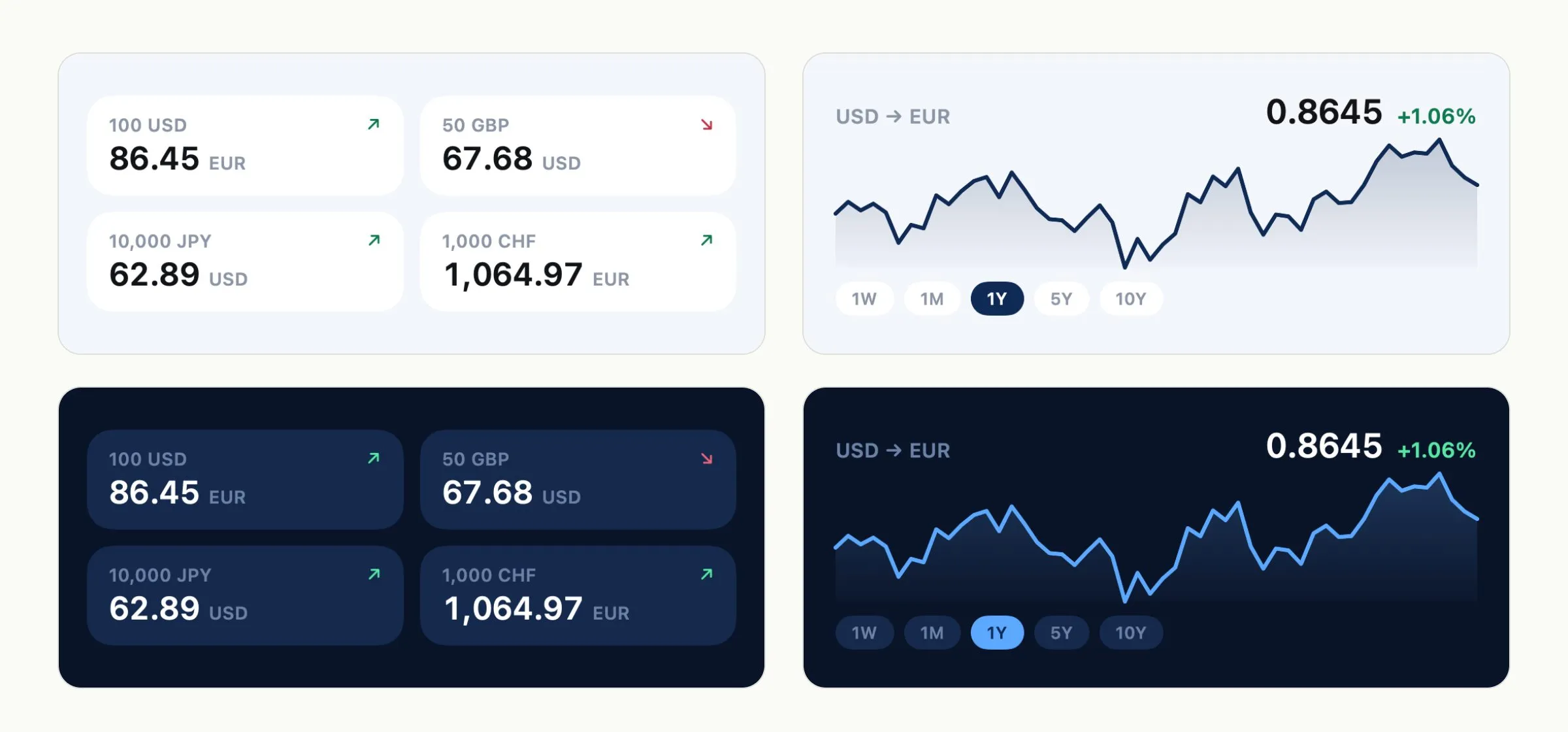
Widgets are where the rule matters most, because a widget is read without being opened. There are four kinds, Rates, Chart, Converter and Gold, plus a lock-screen pair, and every face carries the stamp, so a stale widget says so on the Home Screen. The gold widgets carry regional prices for Dubai, India, Kerala, Kuwait and Pakistan. There are no accounts, no analytics and no tracking, because an app about real numbers should not keep a quiet ledger of its own.
Principles
- Show the real rate, and say how old it is.
- A number the app did not fetch must never pass for one that it did.
- Design the element that cannot lie first, and let it set the standard for everything else.
- No accounts, no ads, no tracking.